Work / Capital City College
Capital City College
Capital City College is one of the largest further education providers in London, training and educating more than 25,000 students a year. It grew out of the mergers of three colleges: Westminster Kingsway, City and Islington, and the College of Haringey, Enfield and North East London. In 2024 a new leadership team set out to change both its culture and the way it presented itself to London. I led the strategy and brand architecture, and partnered with design studio We Mean This, to create the new identity.

Context
The three colleges had kept much of their autonomy: what they taught, and how they marketed themselves. Each had several campuses, known for their own specialities, from culinary arts at Westminster to the sixth form at Angel. Admissions were centralised, so applicants met three brands, a group name and a maze of campus names before they found a course. The group was arguably the largest college in London, and almost nobody knew it.
The brief, from the Chief Marketing Officer, Simon Downing, asked for a clear and cohesive architecture to unify the colleges under the masterbrand, keep their local equity, and leave room for future colleges and partners. Underneath it sat a bigger change. The new CEO, Angela Joyce, wanted a culture of creativity, transparency and partnership, and to challenge the perception of further education as second best to university.
Question
Can one college be bigger than the sum of its parts?
What we did
I started by listening carefully to the CEO, the executive team and leaders across the college. I asked what the college was for, who chose it and why, and how people actually referred to it. They described the same purpose in different words: helping people find their way through education into work and careers. They also agreed on what set the college apart: careers, not just courses; a genuinely inclusive college; strong links with industry; and London as its centre of gravity.
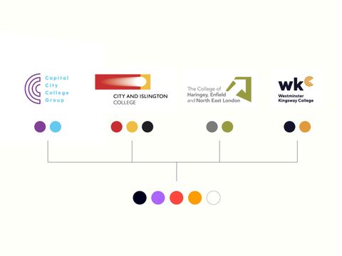
CCCG and its Colleges at the start of the project
The brief asked how to lock up three college logos with a group logo. I found a simpler underlying question: is this a group of colleges, or one college? Nobody chose a college by its corporate name. People talked about places, Angel, Westminster, Tottenham, and what each was good at. The equity was in the campuses and their specialities, not in the middle tier.
We tested three hypotheses with the leadership team, from a tidier version of the group to one distributed college. We chose the simplest and most radical: one college, with campuses across London. "Group" was dropped from the name, the three colleges stepped back, and the specialities became centres of excellence, told through communications rather than logos. Capital City College Training became Apprenticeships+. The Sixth Form and MOSAIC@SOHO kept distinct identities, while still clearly part of the family.
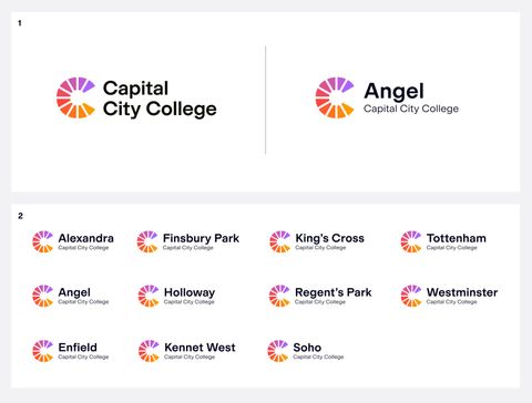
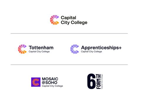
Matt Beese and his team at We Mean This turned the architecture into an identity. Its C is made of ten wedges, the campuses coming together as one diverse and vibrant college. The same marque carries the masterbrand and every campus; on a campus lockup the hierarchy flips, so the place comes first and the college underneath. Apprenticeships+ takes its own colours, and the Sixth Form a louder voice of its own.

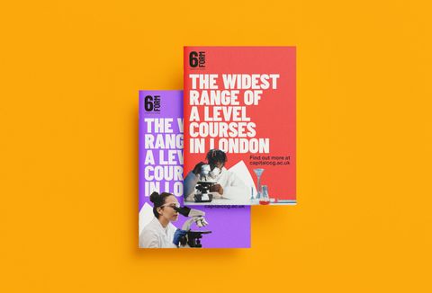
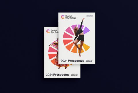
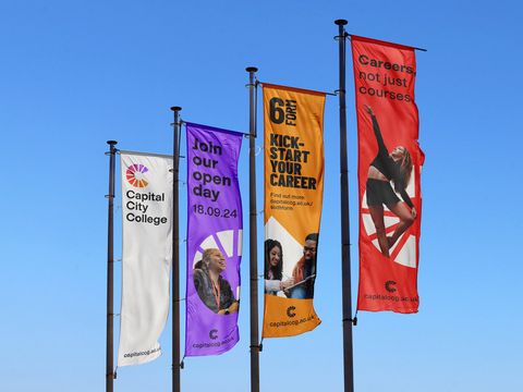
Brand Applications
What changed
The three colleges now trade as one: Capital City College, one name and one identity across every campus, with Apprenticeships+ and the Sixth Form alongside. Applicants meet a single college, while each campus keeps its own character and local relevance.
More work