Work / MotoGP
MotoGP
MotoGP has been the world championship of motorcycle racing since 1949. In 2023 its owner, Dorna Sports, set out to make it a global entertainment brand that a new generation would choose. I worked on it in two stages: first as strategist with Angus Hyland's team at Pentagram, devising the strategy behind the new identity; then independently, after MotoGP's first fan research, bringing the two bodies of work together and helping the teams put them to work. Our synthesis integrated the two, building the fan insight into the strategy.
Context
MotoGP first approached Pentagram in 2021, but changes in leadership stalled the project for two years. The brief, unchanged when it restarted, asked for an identity fit for the digital age, a framework for MotoGP and its sub-brands, and a way to reach new generations of fans.
The problem went deeper than the identity. MotoGP was, as the leadership put it, the most exciting sport on earth, but its brand hadn't kept pace with its product. It wanted to become an entertainment brand centred on fans; outsiders saw a niche sport for gear-heads.
Question
How can we reach and ignite a new generation of fans?
What we did
Stage 1
Rebrand: Strategy & Identity
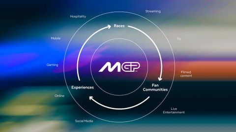
The first stage of strategy, prompted by brand director Nuria Garcia's identity brief, started from what MotoGP was and its leaders’ vision. I interviewed them and spent race weekends in the paddock. The story we found had three sets of characters: the riders and their bikes; a support system of teams and partners; and a community of fans, from the purists to the tourists. The brand needed to hold the entire media and entertainment ecosystem, revolving around the races, the fans and the experiences it delivered.
MotoGP Brand Ecosystem
Logo genesis by Pentagram
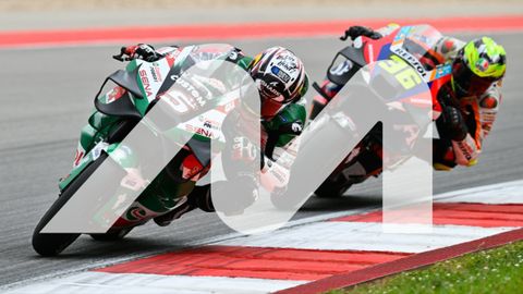
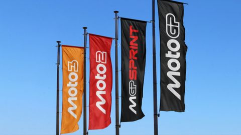
Angus Hyland's team drew the logotype from the sport itself: the M leans like a rider into a turn. A custom typeface, made with F37, and the brand was set in black or white, to support the wide range of colours of the teams and sponsors. We devised a simpler architecture to bring the championships and products into one family.
The visual identity system in application
With Pentagram's brand narrative team, we develop the story, tone of voice and a tagline: Faster. Forward. Fearless.
MotoGP brand launch film, produced by Nomad Studio
What we did
Stage 2
Insights-led strategic synthesis & alignment
Following a successful rebrand, new questions needed attending to. When Kelly Brittain joined as CMO, she commissioned agency jump! to gather new insights about what young fans wanted from live sports and media; she now needed to define how MotoGP would provide it. The first stage work captured the essence of racing: forty-five minutes nobody can script, where riders defy fear, logic and gravity. Our task was to build on that work and integrate the missing element. In synthesis: jump's Magnetic Defiance as the brand's DNA; our Faster. Forward. Fearless. as the consumer-facing brand sign-off; and a new campaign, Wired Different, devised by the marketing team with agency Ultra in London, to launch the new season.
The next step was to make it live in the organisation. In November 2025 I ran six workshops in Barcelona, in the different languages each team works in: words, pictures, voice and commercial. For many it was the first time in a room with colleagues from other departments. Working out what the spirit of magnetic defiance looks like in practice beats any guideline: stop telling people MotoGP is the most exciting sport on earth, go on showing it.
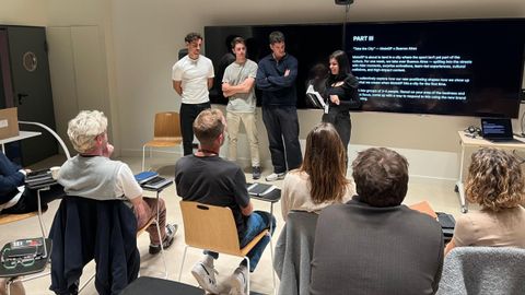
Tone of voice workshop, Barcelona, Nov 2025
In 2026 we worked with the social media team, who publish more than anyone, on a Hierarchy of Defiance: when to dial the brand up, when to hold steady, and when to show restraint. The dial moves, but it's never off. It is now the core of MotoGP's tone of voice playbook.
I led stage two through my own consultancy (Do & Company), with collaborators Katee Hui on strategy, Colm Larkin on tone of voice and Alexie Sommer on workshop facilitation.
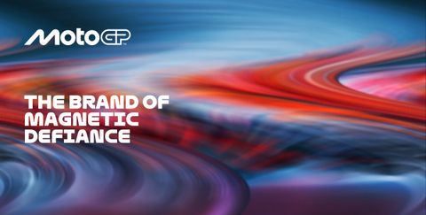
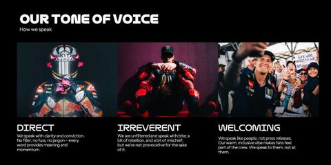
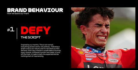
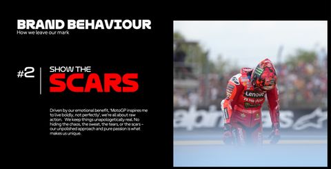
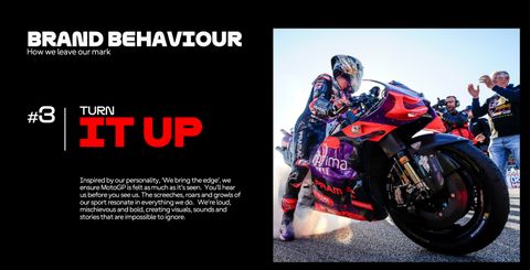
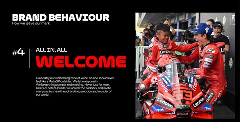
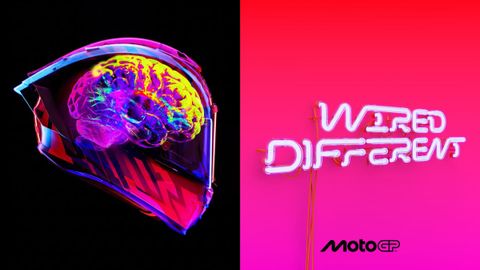
Stills from the brand book + ‘Wired Different’ Campaign by Ultra London
- See the full identity story on Pentagram's site ↗
- Grand Prix and Gold wins at Transform Awards ↗
- Wired Different campaign by Ultra London ↗
What changed
MotoGP's first season under the new brand, 2025, was its best yet, with a record 3.6 million fans at the track. In February 2026 Dorna renamed itself after its main brand: MotoGP Sports Entertainment Group. The identity won the Grand Prix and four golds at the Transform Awards Europe. Inside, the strategy has moved from a deck into daily practice and decisions: what to film, what to post, and what to leave out.
More work
Fedrigoni
How do you combine centuries of authority and innovation to build a cohesive global brand?
Eurosport
How does a brand people trust become one they love?
MUBI
How can MUBI make great cinema more accessible to more people?
Capital City College
Can one college be bigger than the sum of its parts?